
The Heart of Pride
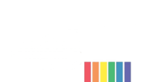
The artist in me is a little obsessed with the rainbow. Not the flag. The spectrum. The science of color. The way each color has an ordered and equal place of its own.
I always have a difficult time in art supply stores because I never want one color; I want one of every color.
As a kid, I only wanted the big box of crayons, the monster set of watercolors, the mega-pack of colored pencils.
I am baffled by the question, “what is your favorite color?”
Huh? What? Don’t stress me!
I like the spectrum. The color wheel. The book of paint chips that fans out into a glorious rainbow. My Pantone color guides, which do the same.
All color is my favorite color.
I have no hesitation when it comes to selecting a specific color for a piece of art, a graphic image, or a paint color to go with my sofa. But please don’t ask me to pick a favorite color!
Color theory is fascinating to me, though references to modern color mixing can be confusing to some depending on the color model used.
For example, traditional pigment mixing relies on red, yellow, and blue (RYB) for primary colors. From their overlap comes the secondary colors of green, orange, and purple.
Other familiar color models are red, green, and blue (RGB)—familiar to photographers and to online graphics. Cyan, magenta, and yellow form the basis for printing presses, and along with black (K) are known as CMYK.
Light and pigment are not the same. Mix all three primary pigments together to create a lovely shade of mud.
White light is composed of all the colors of the rainbow.
So, yes, I am fascinated by color theories, and for multiple reasons. In them we glimpse the natural order that surrounds us—an order that we sense even when we do not understand it or consciously take time to contemplate it.
The sequence of colors in a spectrum is set. Rearrange it, and it no longer is a spectrum. A spectrum can be as simple as three colors, or 300, or far past the point where human eyes can distinguish the differences.
The spectrum in a color wheel is a beautiful example of diversity. It provides for us an equally beautiful pattern for understanding the diversity of human nature—a real circle of life. An understanding that each one of us has a place in the world.
The rainbow is the symbol of LGBTQ Pride. I say expand the colors to a circle—like a color wheel—and connect the endpoints. That changes the dynamics, and creates a different kind of energy. In this context, it could easily be a model for equality—reminding us that it is not about gay or straight, the color of our skin, our religion, our politics, or any of the other contrived ways we have created to prove our individual superiority.
On that kind of “color wheel,” all of humanity—all of nature—is valued for the role it plays in the universe. In that kind of arrangement there is real equality.
At the heart of LGBTQ Pride there is the absolute understanding that we are who we are meant to be. More importantly, that we love ourselves for exactly who we are and for the role we play in the world.
There is healing in that kind of love. It makes us capable of loving others as we love ourselves.
I will never forget the powerful moment in my life when I understood that. It was life changing. I seriously doubt that I would be in Rehoboth doing the work that I do at CAMP Rehoboth without it.
I remember another day too. Steve and I were in our mid 30s, and living in New York. We were on the sofa in our downtown apartment. I’m sure it was a Sunday afternoon. We had been talking for hours. About love. About life. About God, and spirit, and the universe.
Then Steve got it. His own ah-ha moment that brought tears to his eyes. Healing tears that erased old wounds in his soul. The wounds of the closet. The wounds of self-hatred that can eat away at our hearts if we allow them to fester inside of us.
In that moment he knew who he was and that he was exactly who he should be.
In that moment, he grew strong in love.
He went on to become the Steve who dedicated himself to leading CAMP Rehoboth and our community for 30 years.
Both of us were committed to the mission and vision of CAMP Rehoboth because we shared an unshakable faith that creating an environment where all people are valued for who they are changes the world.
Returning to my color philosophy, complementary colors are opposite each other on a color wheel and create powerful combinations when used together: red and green, blue and orange, purple and yellow.
Steve and I were opposites in many ways. Complementary colors, made stronger because we were together. We were always aware that our compromise point made us better leaders—and better able to deal with the day-to-day issues we faced for all of our years together.
Complementary colors can appear to vibrate next to one another—to be electric.
I feel like I’ve been unplugged.
I miss Steve every day, but I am inspired by his love—by our love.
The heart of Pride is love—love for ourselves, love for others, love for the world around us.
In the heart of Pride we celebrate not one, not six, but every color in the spectrum—the whole great, biggest box of crayons we can find!
Happy Pride month! ▼
Murray Archibald is an artist, CAMP Rehoboth Co-Founder, and longtime President of the CAMP Rehoboth Board of Directors. He is currently serving as CAMP Rehoboth Interim Executive Director and Editor in Chief of Letters from CAMP Rehoboth. Email Murray at murray@camprehoboth.com